Standard
The documentation applies to: v0.8.0
Preparation knowledge
Before you read, please ensure you must complete this step. This step will help you to a basic knowledge about Standard Component.
Warning
We assume you have an experience to work with LET Portal, at least login/menu and how to redirect. We just provide some short steps for letting you know a main points
Controls Population
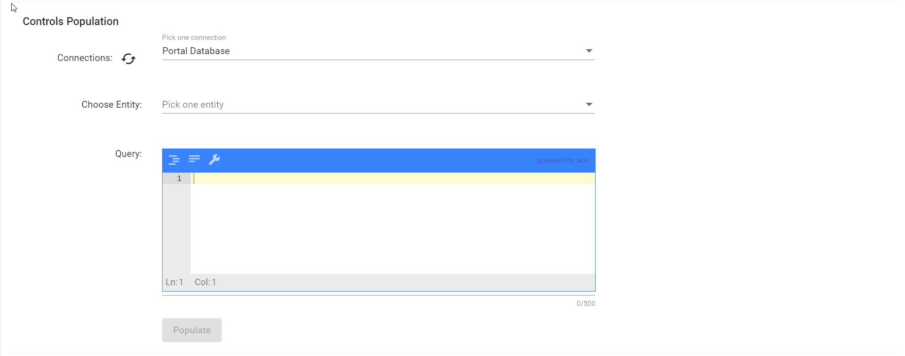
This section is helping you to create quickly these controls by querying your target database. LET Portal will detect based on your query's result to generate some controls.
However, based on your database type, a query is depent on. For example: MongoDB need to use json, and SQL-based need to use SQL.
At reference, you can take a look on MongoDB Expression and SQL Expression
Controls
Control Info
- Control Name: This field indicates an unique control to distinguish another controls in the same Standard. However, it isn't an unique name on a Page. For helping a distinction, we use a pattern name {Section Name}_{Control Name}
- Control Type: According to control type, it will have a different control options and validator groups. Check the table below
Info
Same prefers to a first row
| Control Type | Options List | Validators |
|---|---|---|
| Textbox | label, placeholder, disabled, hidden, bindname | Required, Min Length, Max Length, Regex, Email, Equal To |
| Label | Same | NULL |
| Line Breaker | NULL | NULL |
| Textarea | Same | Same |
| Number | Same | Required, Number, Number Range |
| DatePicker | Same | Max Date, Min Date, Equal, Equal To |
| Checkbox | Same | Required |
| Slide | Same | Required |
| Radio | Same | Radio |
| Rich Text Editor | Same | Required |
| Icon Picker | Same | Required |
| Markdown Editor | Same | Required |
| Select | Same, multiple | Required |
| Auto Complete | Same, multiple | Required |
| Uploader | Same, allowfileurl, saveonchange | Required, File Maximum Size, File Extensions |
| Multi Uploader | Same, allowfileurl, saveonchange | Required, File Maximum Size, File Extensions |
Control Options
Control options are used to configure some properties of control. They are defined by Key-Value instead of a group of controls. However, we also have a hint to help you to fill a correct value. These important options are below (another options are quite easy to understand):
| Option Name | Hint | Default Value | Warn |
|---|---|---|---|
| bindname | Use for mapping data in or out | Same as control name | See concept |
| disabled | An Evaluted Expression string, it allows user to change a value | NULL | See expression |
| hidden | An Evaluted Expression string, it allows user to change a value | NULL | See expression |
| multiple | Only for Select and Auto-Complete, allow user can select multiple values | false | |
| allowfilreurl | Only for Uploader and Multi Uploader, allow set downloadable url instead of file id | false | |
| saveonchange | Only for Uploader and Multi Uploader, allow upload a file manually | false | This mode is still developing |
Selection Controls
We have three selection controls which want to have a datasource. They are Radio, Select and AutoComplete.
A datasource can be Static, Database or Web Service. However, we need to ensure a json data should be an array with child element contains two properties name and value:
[
  {
    "name": "MongoDB",
    "value": "mongodb"
  }
]
Limitation
We are still developing Web Service datasource and OutputProjection for this feature. So you can use $project on MongoDB or SELECT as on SQL for projecing name and value
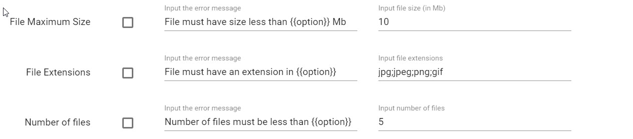
Validation Options
These options are helping to check a valid state of control's value and showing an error message. There are nothing special on these options. A minor note is you can display a option (the most side textbox on a row) value by using {{option}} on error message field.
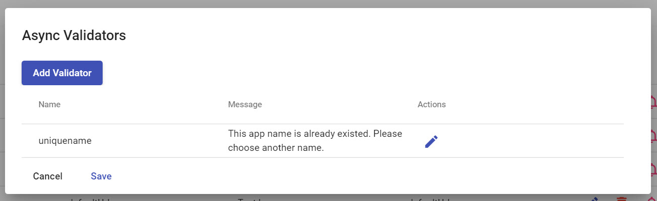
Async Validators
A most difficult understanding of control is async validator. Async Validator is a technique which helps a value to be validated before sending to server-side on submitting step. It doesn't block an user's behavior on website and quickly help user to find out a valid value.
There are two types of async validator:
- Database validator: you need to query a database for ensuring no found data. We recommend this way for small query and this database is yours.
- HTTP validator: you need to perform an ajax call for checking with another web service. We recommend this way for complicated case.
For example, you can edit App Form Standard and click on "Edit Async Validators" button on name control to show.
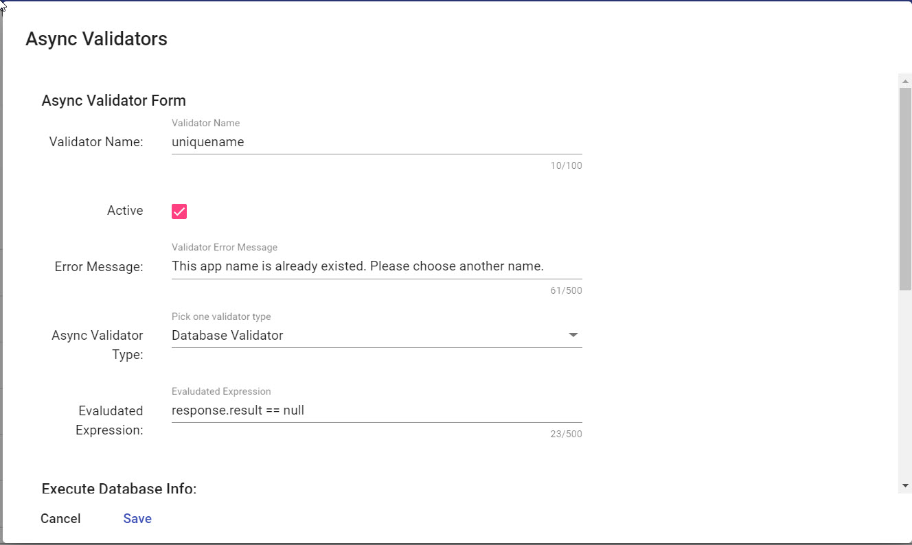
For these configurations, they are the same with these setups that we have done. Only one field we need to highlight, it is Evaluated Expression. This field is using to evaluate a response of Database Validator or HTTP Validator. It is valid when expression is true, otherwise is false
This field is using only response var to access a result of Database Validator or HTTP validator. For example with App Form, a string "response.result == null" is true if there is no app name is existed on database.
Note
response.result is a default result's model when you execute query on Database. A model is below
{
    result: any,
    isSuccess: boolean,
    error: string
}
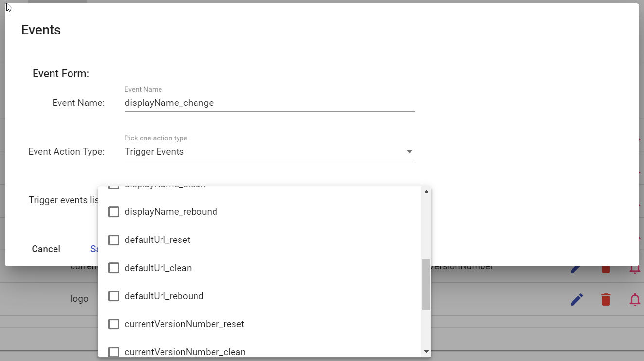
Control Events
Control events are the built-in event on LET Portal. These events can't be added or removed. Also they can configure the chaining events such as triggering change, reset default value of another control.
There are three action types of control's event:
- Trigger Events: Allow to trigger multiple events on the same section
- Query Database: Allow to query on database to fill values
- Web Service: Allow to call HTTP web service
For more detail about Chaining Events, read here